Apkudo - Ongoing

Building a cohesive brand system for a complex ecosystem

Brand Refresh / Brand System / Web Design
Building wall mural showing a hand holding a smartphone with the text 'Intelligent Device Diagnostics, Anywhere.' and the Apkudo logo.
Overview

Designing for Apkudo’s next phase of growth

Apkudo is a software and robotics company that provides a platform delivering data on mobile device quality, history, and location, alongside robotic solutions that automate device processing. In 2024, as the company entered a new growth phase, I led a brand refresh and developed a scalable design system to support marketing, sales, and product storytelling across channels.
Timeline

Brand Refresh (March 2024 – May 2024)

Brand System Development (May 2024 – Present)

Role

Lead Designer, Brand and Marketing Design

Problem

A technology platform without a brand to match

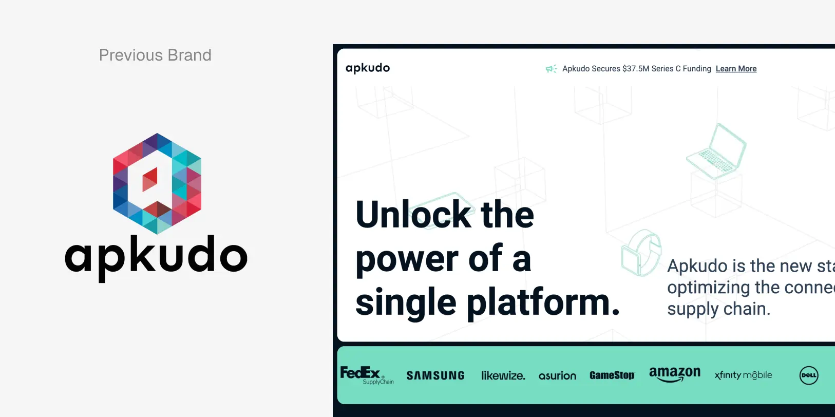
Apkudo was refining its messaging and preparing for growth, but its brand did not reflect the sophistication of its technology. The identity felt provisional, marketing materials lacked cohesion, and design execution relied heavily on outsourced support. The brand needed clarity, distinction, and a system that could scale.
Side-by-side comparison of Apkudo's previous colorful hexagonal logo and current website screenshot with text 'Unlock the power of a single platform' and logos of clients including FedEx, Samsung, GameStop, Amazon, and Dell.
opportunity

Turning a refresh into a strategic reset

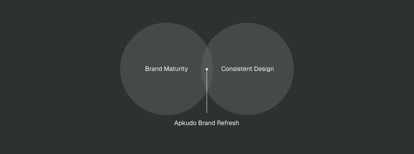
Rather than applying a surface-level refresh, I saw an opportunity to refresh Apkudo’s brand both visually and structurally. The goal was to create a brand foundation that matched the maturity of the product while enabling faster, more consistent execution across teams.
Venn diagram with two overlapping circles labeled Brand Maturity and Consistent Design, with the overlap labeled Apkudo Brand Refresh.
Solution

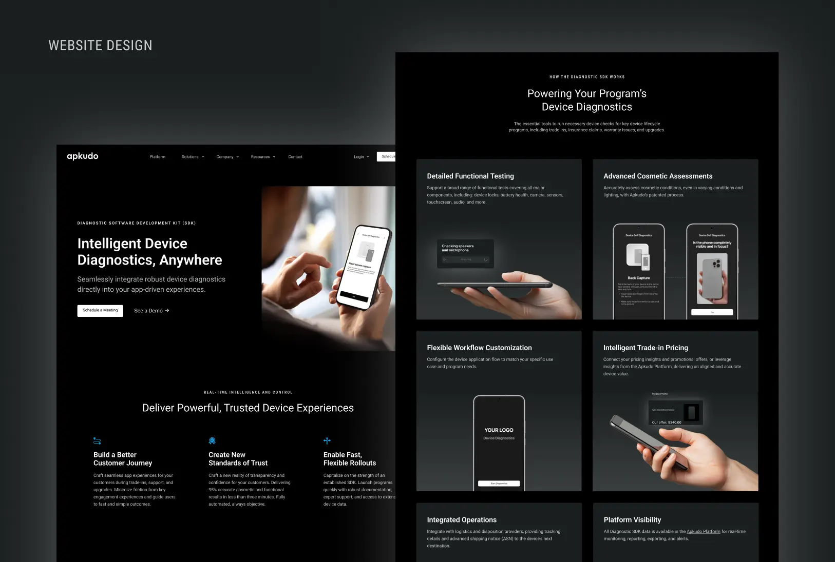
Building a brand defined by clarity and confidence

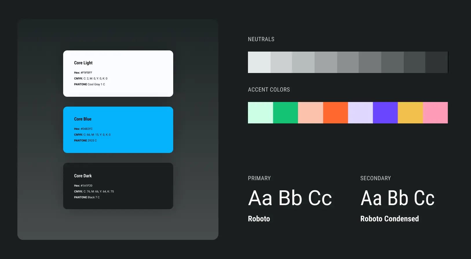
I refreshed the visual brand around clarity and confidence, introducing a more refined, high-tech aesthetic grounded in a restrained neutral palette. Intentional use of blue reinforced trust and innovation, while dark-forward layouts allowed product visuals to take center stage.

Beyond the identity, I built a modular brand system in Figma, including reusable components, templates, and structured guidelines. This shifted the team from one-off asset creation to a scalable, pattern-based workflow that supported consistent execution across web, social, and sales materials.
Hand holding a stylus pointing at a tablet screen with an overlay showing program status of 12,352 out of 26,352 devices returned, 46% completed with an orange progress bar.
Brand Foundations

Expressing the device lifecycle through form

The identity began with research and competitive analysis to uncover opportunities for differentiation in a landscape of generic enterprise tech branding.

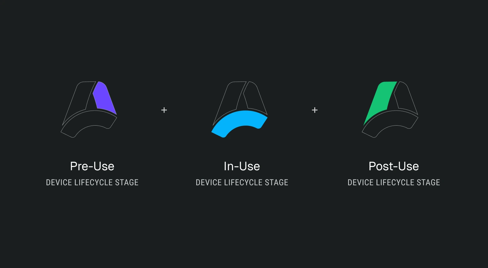
I defined six core brand descriptors—connected, futuristic, confident, simple, sophisticated, and transformative—and used them as a filter throughout logo exploration. I intentionally avoided overused lifecycle tropes such as arrows and network lines. Instead, I explored dimensional forms that could communicate movement and layered systems without visual noise.

The final mark is a continuous ribbon-like form abstracting an “A,” symbolizing both Apkudo and the ongoing device lifecycle. Its segmented structure references pre-use, in-use, and post-use, expressing structured complexity in a simplified form.

A dark neutral visual system reinforces technical confidence and clarity, creating contrast that allows UI and product imagery to stand out.
Apkudo logo with a three-color abstract 'A' symbol and white text on a dark gradient background.Robotic arm inspecting a smartphone with an overlay showing ‘Smartphone A Grade’ and estimated resale price of $235.00, alongside text about data-driven decisions for mobile devices.Diagram showing three device lifecycle stages: Pre-Use with purple highlight, In-Use with blue highlight, and Post-Use with green highlight.Person using a laptop on an outdoor wooden bench, viewing a webpage about trusted user-friendly consumer trade-ins with an image of a smiling woman holding a smartphone.Brand style guide showing core colors with hex, CMYK, Pantone values; grayscale neutrals; accent colors; and primary and secondary Roboto fonts.
Brand System / In Use

Turning the brand into a system

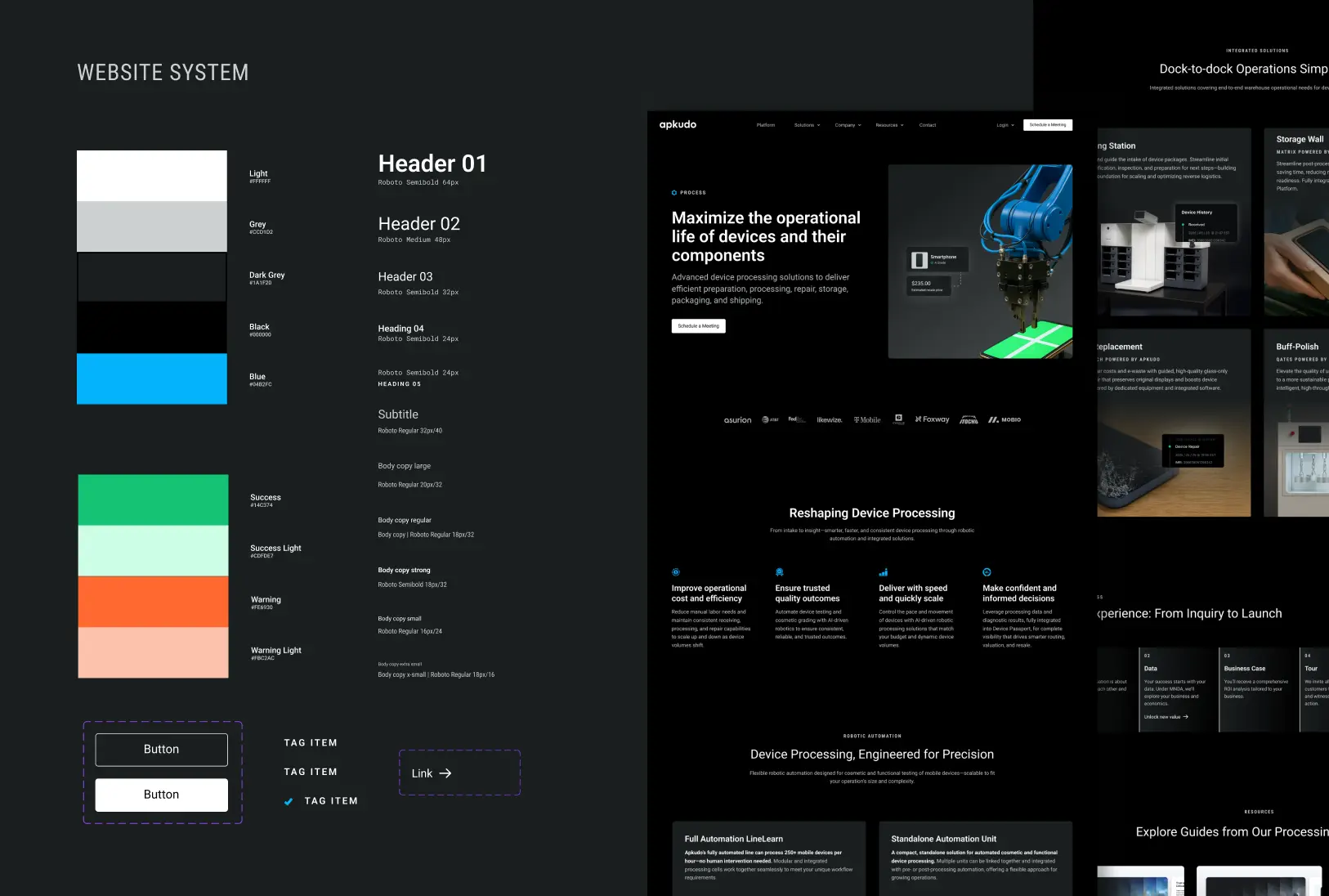
To ensure the identity could scale, I translated it into a design system built primarily in Figma. I developed a centralized brand library with reusable components, layout frameworks, and visual standards to maintain consistency across channels.

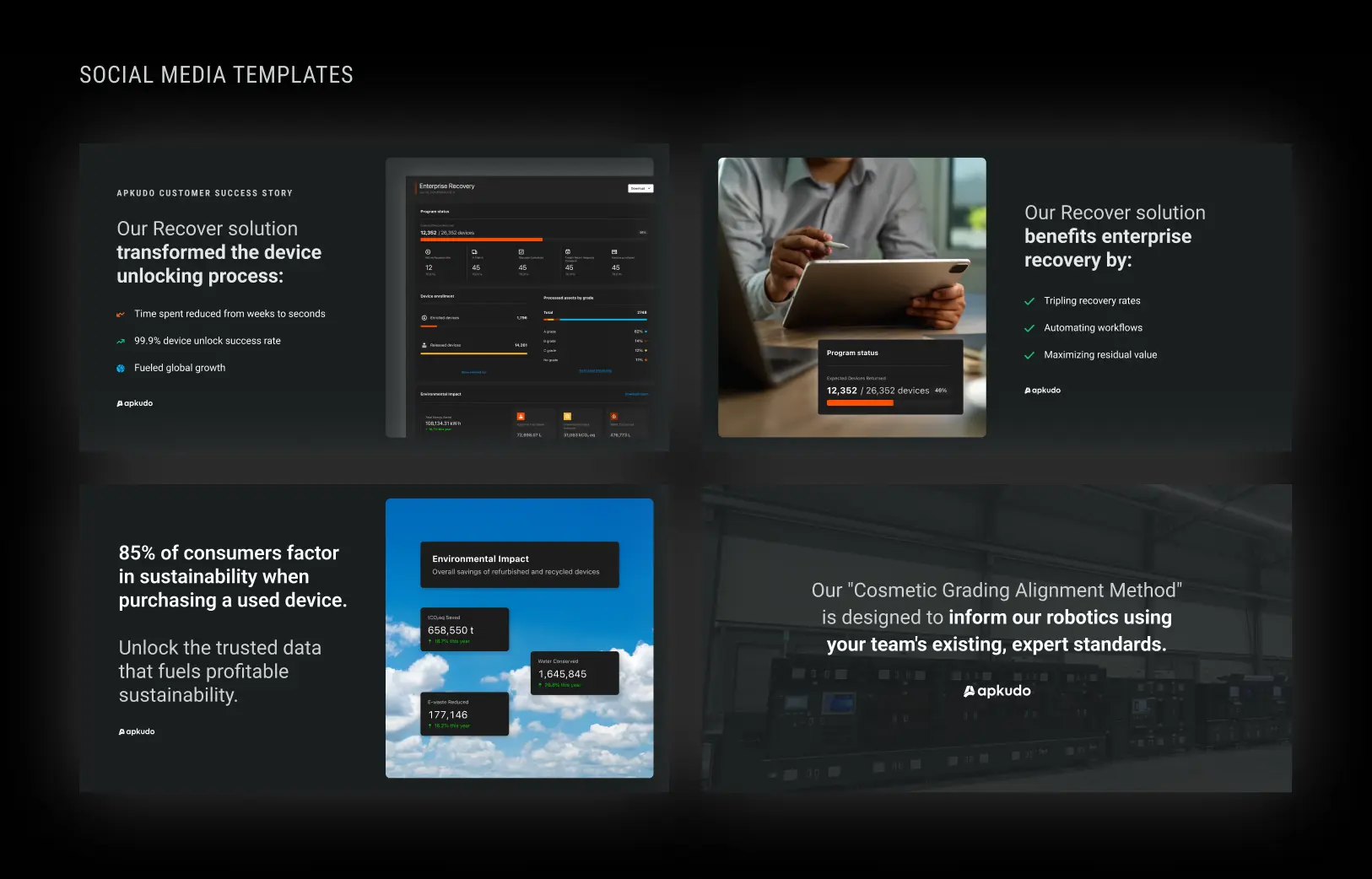
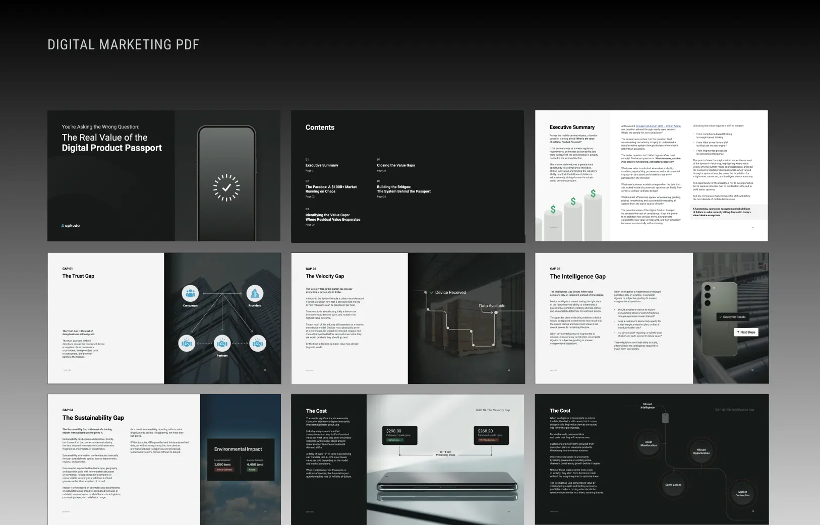
I also created structured templates for presentations, social content, and marketing materials to empower cross-functional teams to work efficiently while staying on brand. Website component libraries streamlined page builds and supported evolving content needs.The result was a flexible brand foundation that improved speed, consistency, and internal confidence across touchpoints.
Content
Four social media templates by Apkudo showcasing Recover solution's device unlocking success, enterprise recovery benefits, sustainability impact stats, and a robotics cosmetic grading alignment method.Nine-page digital marketing PDF layout with sections titled The Real Value of the Digital Product Passport, Contents, Executive Summary with bar graph, and detailed gap analyses including The Trust Gap, The Velocity Gap, The Intelligence Gap, and The Sustainability Gap with charts and device imagery.
Website
Website system style guide showing color palettes, typography styles, buttons, and a dark-themed device processing webpage layout.Website design showcasing Apkudo diagnostic software development kit with features like intelligent device diagnostics, functional testing, cosmetic assessments, workflow customization, trade-in pricing, integrated operations, and platform visibility.
Learnings
  • A strong brand functions as infrastructure. It must evolve without losing clarity.
  • Clarity and restraint communicate more confidence than visual complexity.
  • Design systems become powerful when they remove friction and enable confident execution.