The Apkudo Brand
Role: Lead Visual Designer
Industry: B2B SaaS &
Time: 2024 – Present
.webp)
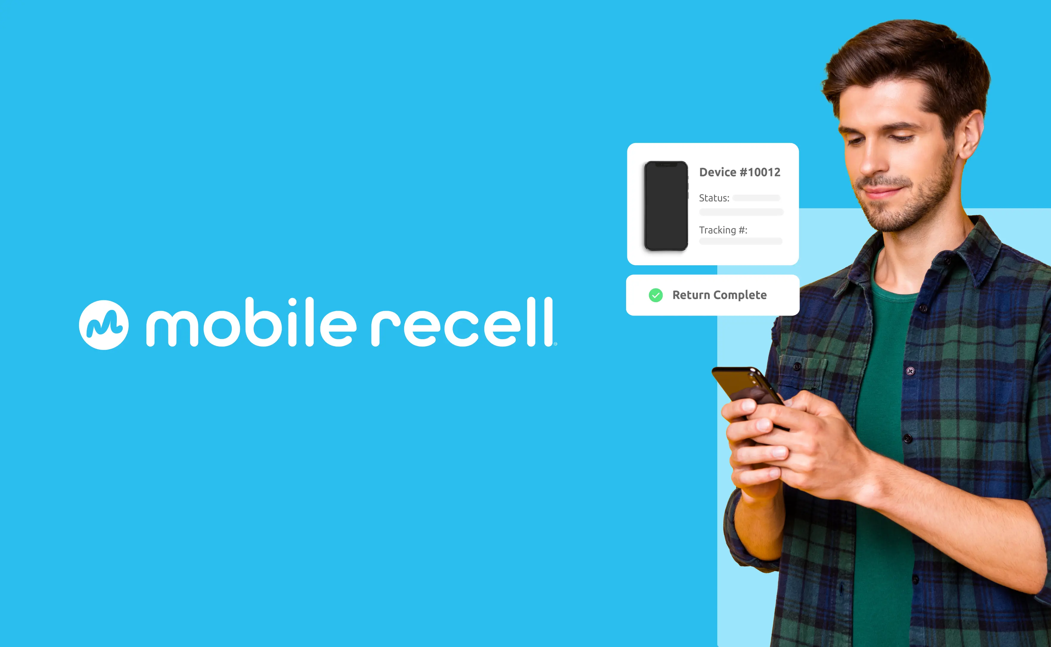
Apkudo provides the first Device Passport™ platform, offering end-to-end visibility into a mobile device’s lifecycle—like a Carfax for used devices. Their software also automates device testing and processing in large-scale warehouse operations, serving leading device manufacturers, wireless carriers, and global device lifecycle and insurance providers.
After more than a decade of growth, Apkudo’s branding no longer reflected its cutting-edge technology or ambitious vision. The rebrand aimed to establish a distinctive, modern identity that differentiated Apkudo from competitors and reinforced its position as an industry leader.
.png)
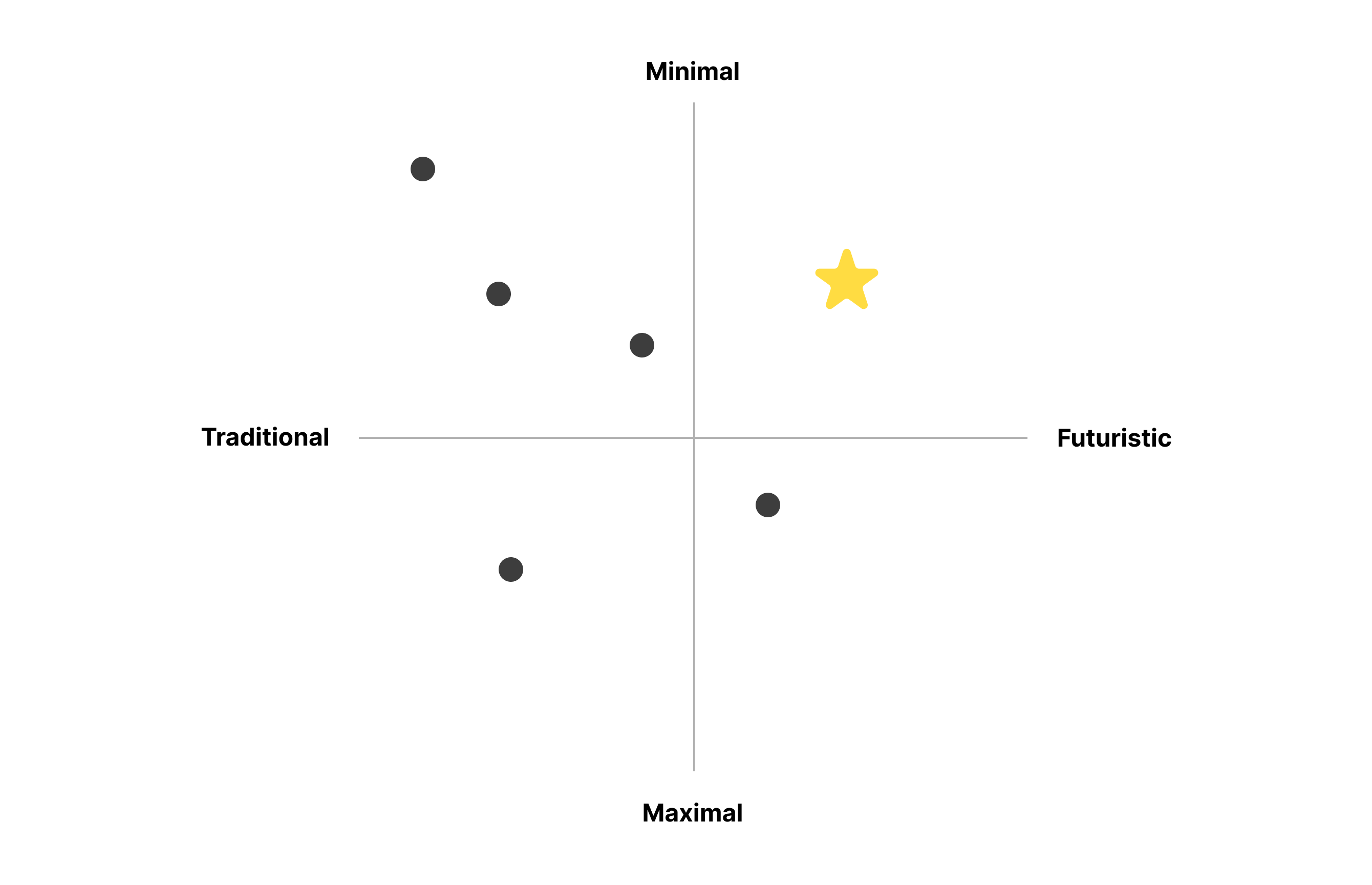
The logo redesign began with in-depth research: reviewing key company materials, collaborating with internal teams, and analyzing the competitive landscape. Competitor analysis revealed an opportunity for a futuristic yet minimal brand. The goal was to visually position Apkudo as a sophisticated, future-forward company that makes device lifecycle operations transparent, simple, and connected.
The final mark represents the circularity of the device lifecycle in a unique, modern form. A triangular, segmented shape resembling an “A” symbolizes Apkudo, with three sections representing the main stages of a device’s life—pre-use, in-use, and post-use. Each segment is assigned a distinct color to reflect the unique complexities of each phase.
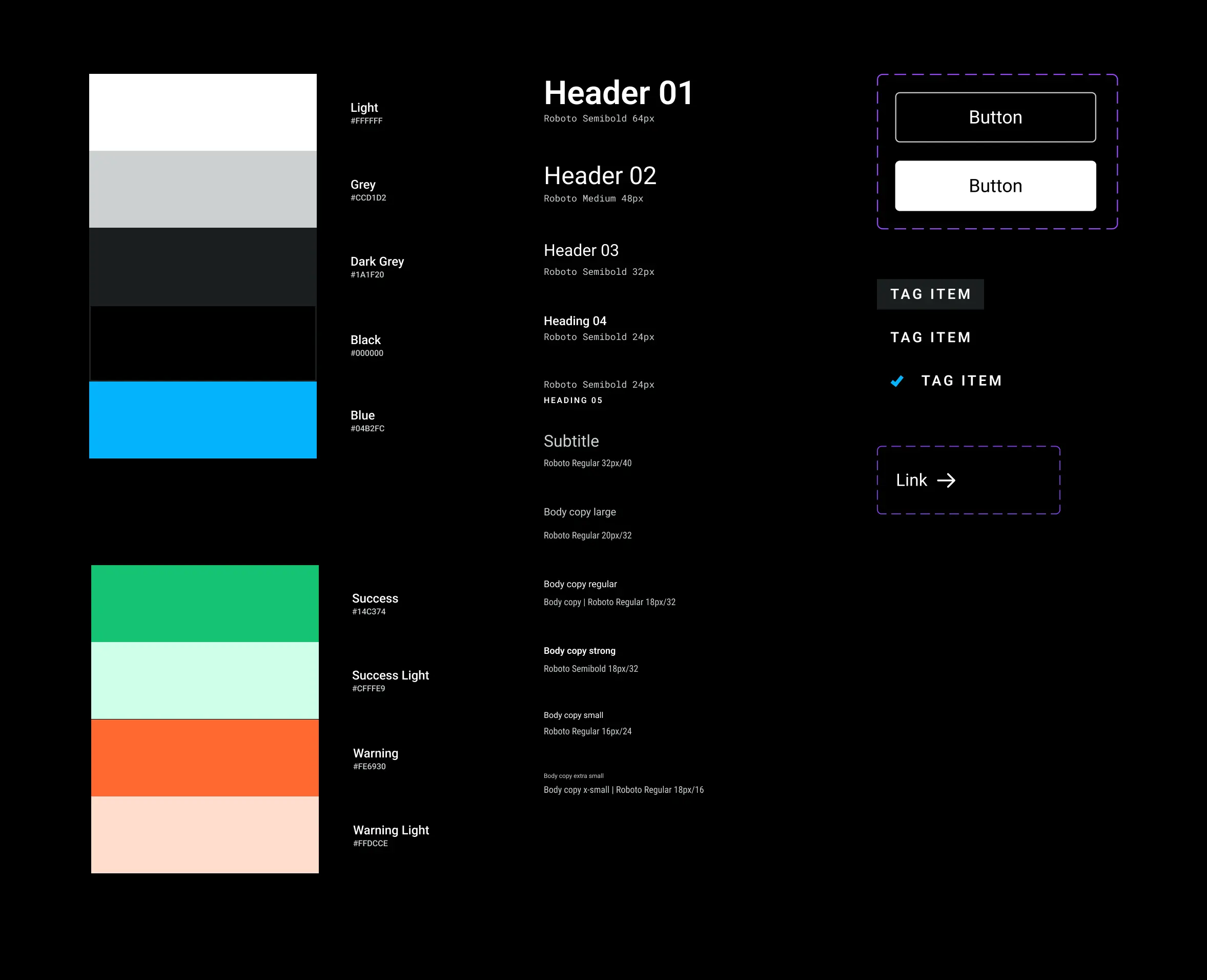
Brand System
Apkudo’s users operate across every touchpoint of the device lifecycle, often in environments of disorganization and uncertainty. They are pragmatic and responsive to solutions that deliver clear, tangible results rather than marketing fluff.
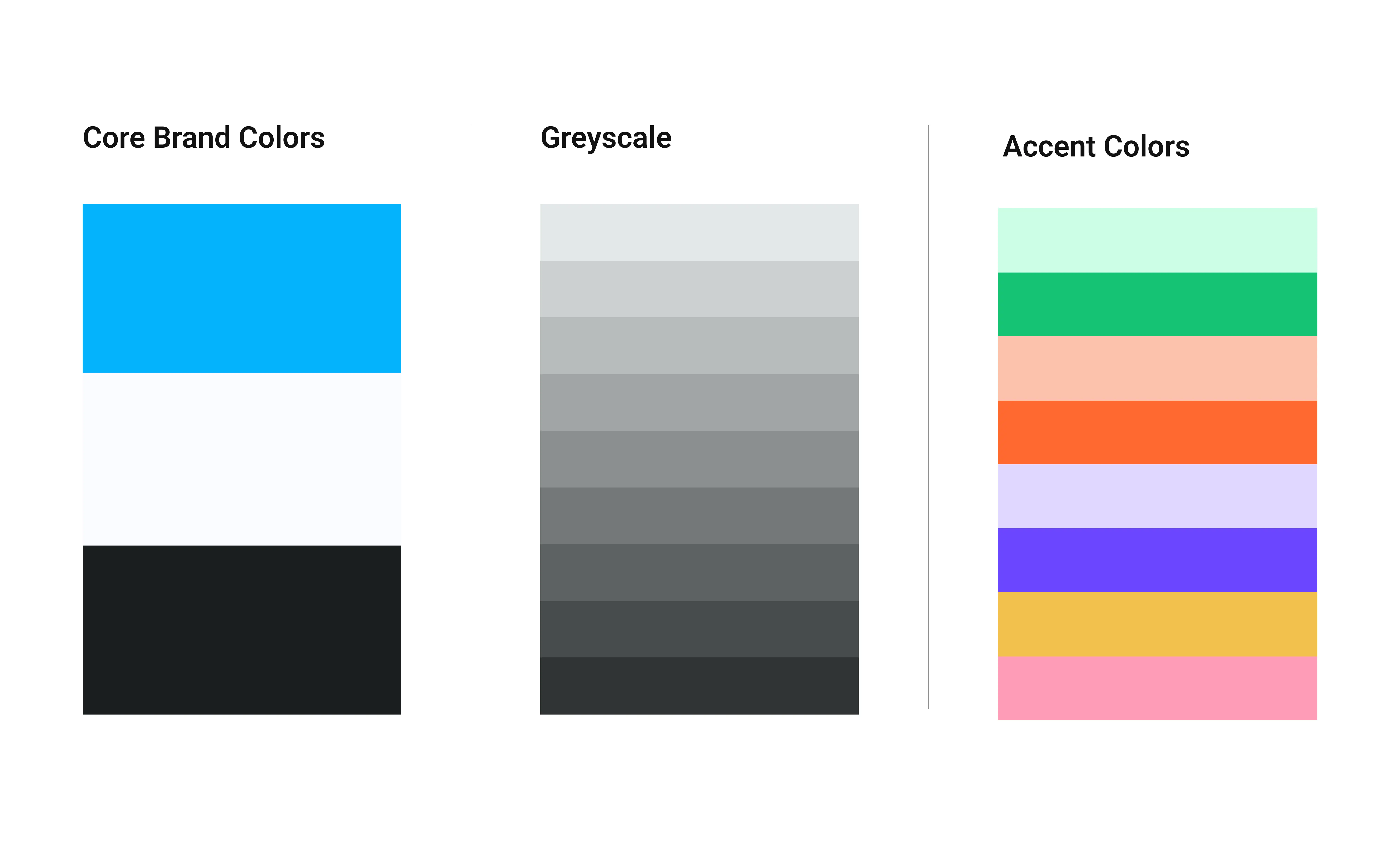
The visual system communicates clarity, confidence, and simplicity. A greyscale palette with intentional color accents (Apkudo blue for icons, underlines, and highlights) positions the brand as high-tech and modern. Minimal design ensures product images take center stage, while subtle gradients add depth and dimension. Photography of devices, people, and environments contextualizes Apkudo’s solutions in real-world scenarios.
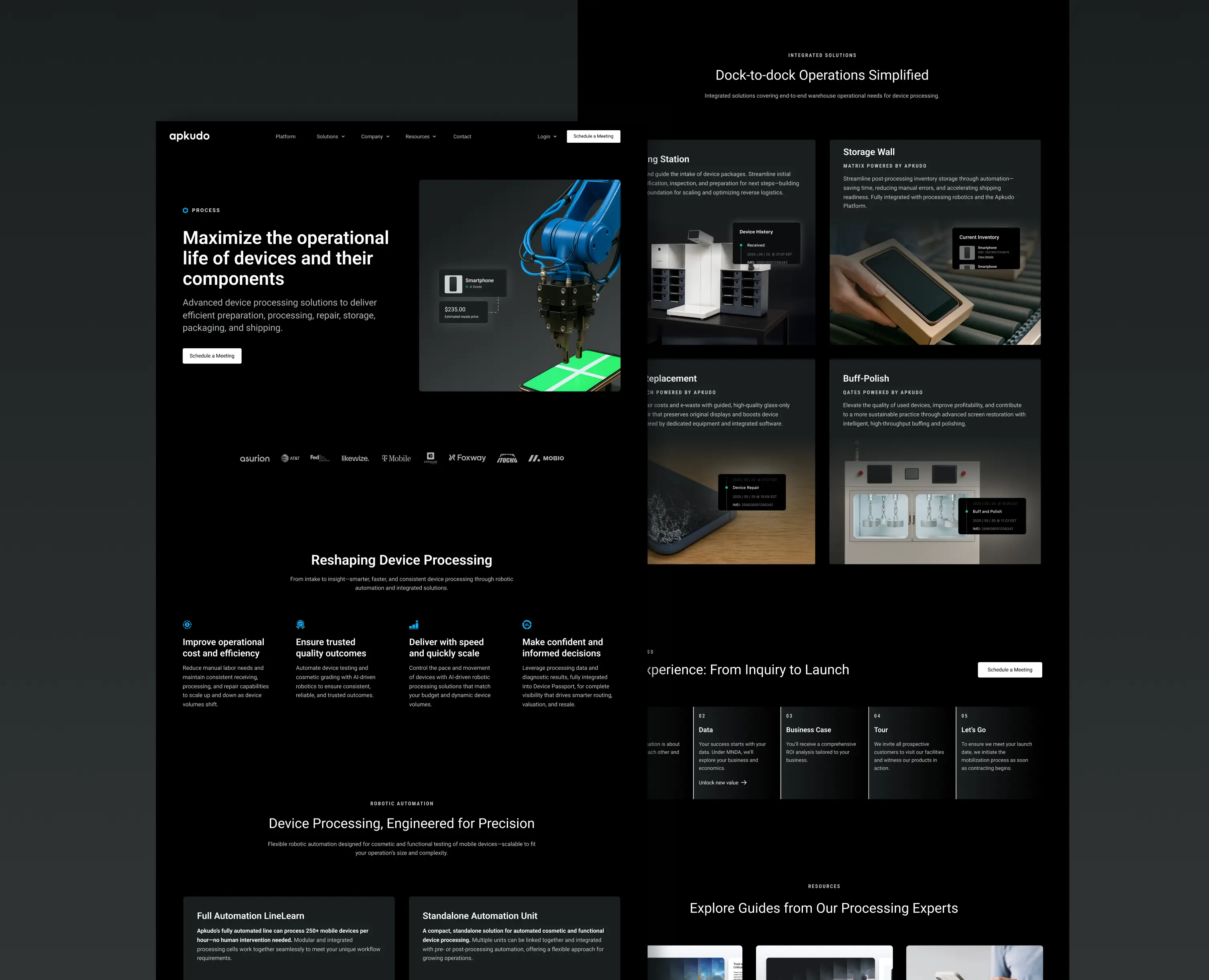
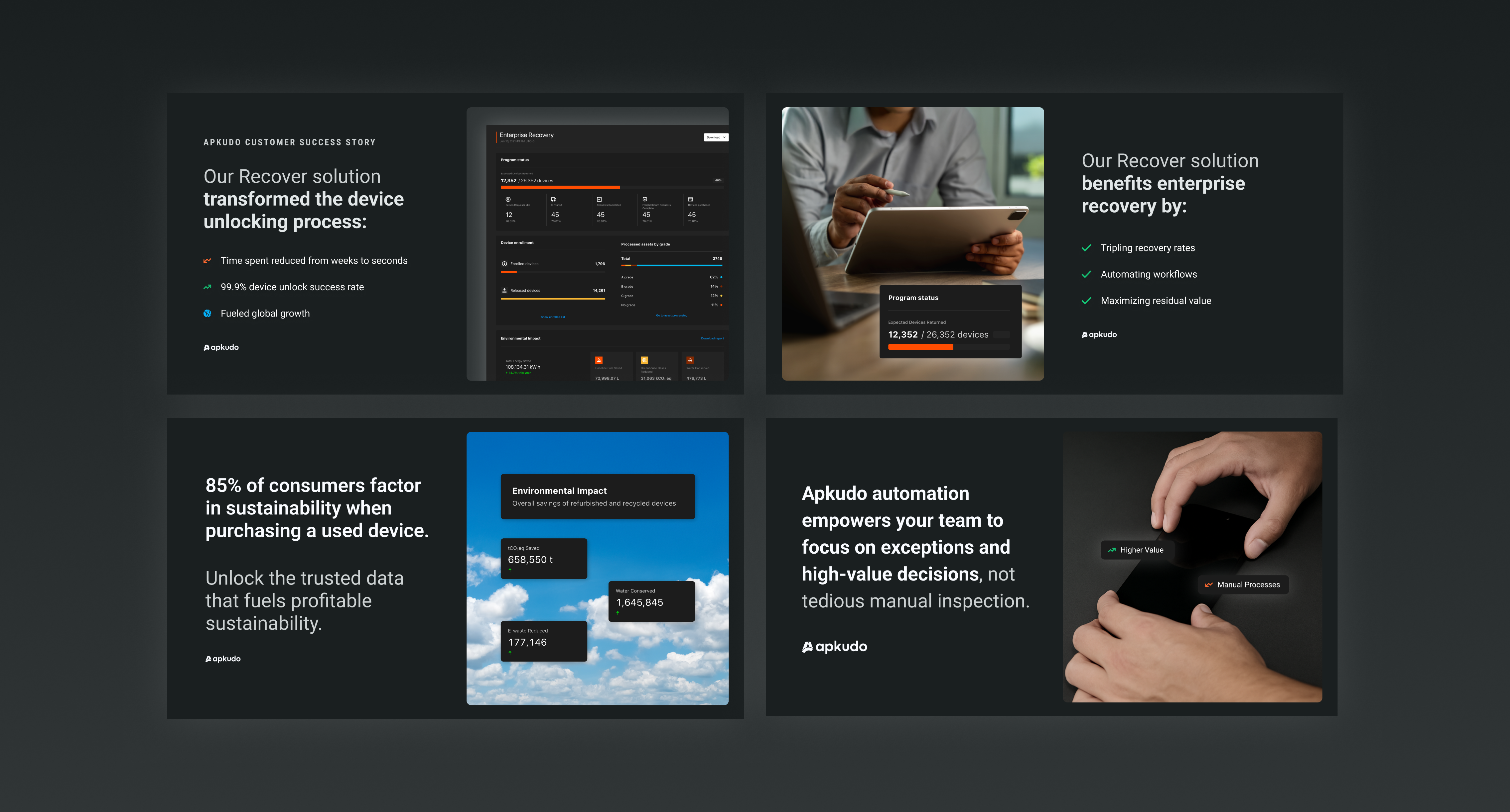
Website
Designed in Figma and built in Webflow, the website showcases Apkudo’s products and expertise with an intuitive, visually clean interface.
Following the rebrand and website redesign, annual website traffic increased by over 200% year over year. Conversion rates remained stable during this growth, demonstrating that the new brand system and website improved visibility while maintaining clarity and user trust.
.webp)
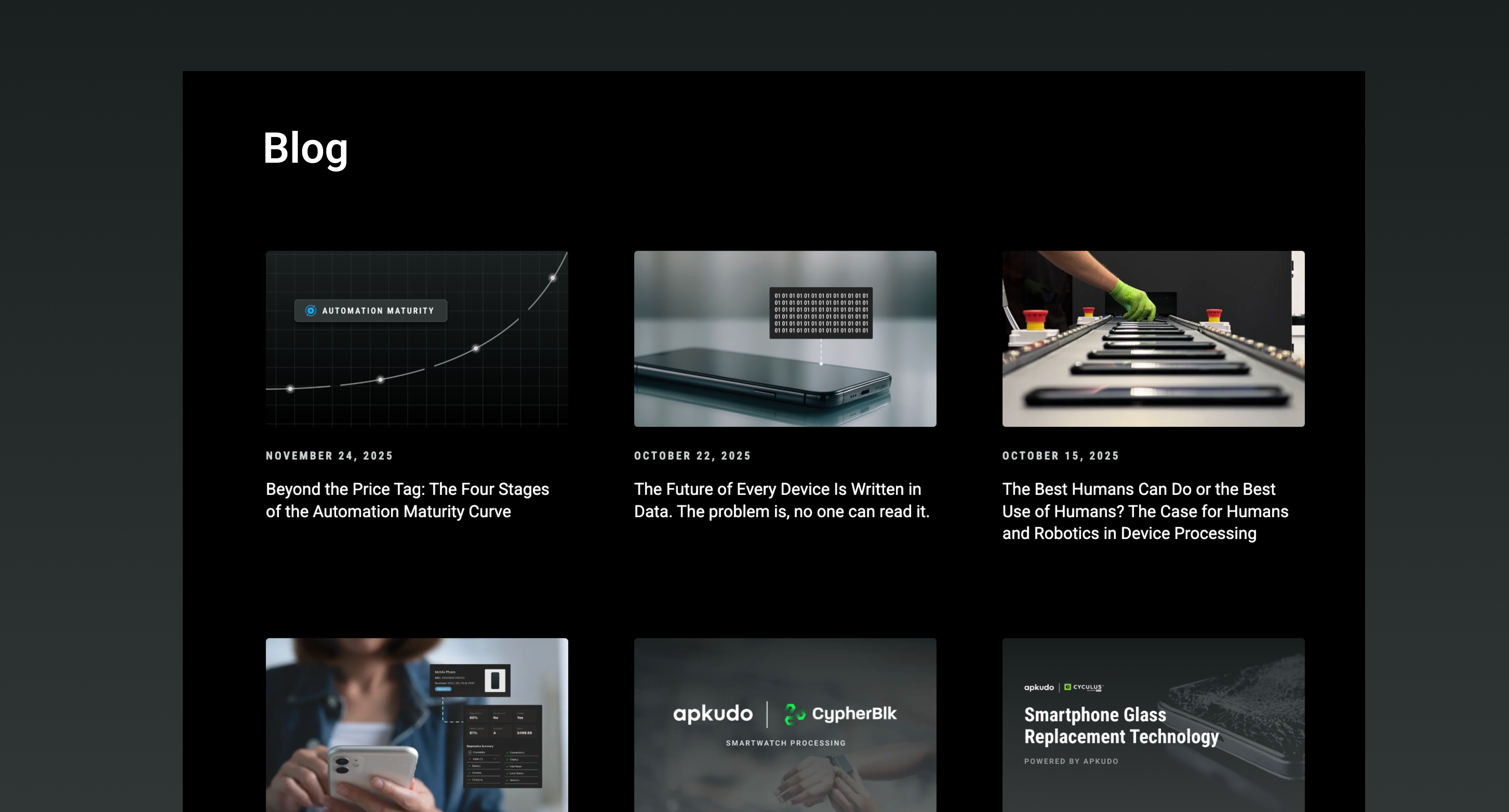
Content
Content assets, including blog thumbnails, presentations, and social media sets, extend the brand system across marketing and communication channels, maintaining consistency and reinforcing the high-tech, approachable identity.
LinkedIn followers grew from ~2,000 pre-rebrand to 10,000 post-rebrand, demonstrating a 5x increase in brand visibility and engagement among industry professionals.
.webp)