Mobile reCell Brand
Role: Lead Designer
Industry: B2B SaaS
Completed: August 2021
.png)
Mobile reCell, now part of Apkudo, was a leading provider of software solutions specializing in corporate device recovery for large organizations. The company revolutionized the industry by delivering unparalleled data transparency and a user-friendly experience previously unavailable in the market.
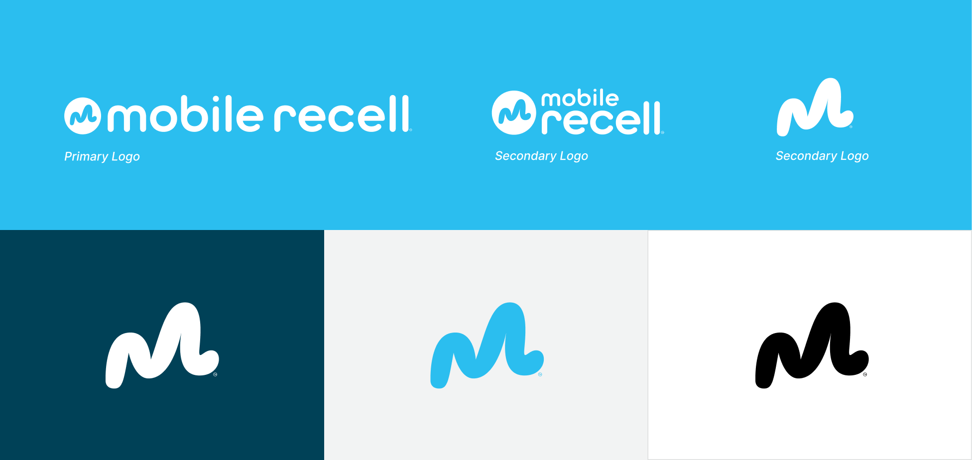
I joined Mobile reCell in 2019 as their first designer, tasked with building the company's visual brand from the ground up. In 2021, we undertook a rebrand to position Mobile reCell as a more mature and cohesive brand, aligned with the company’s growth and evolving goals. This rebrand included a new logo and a refreshed overall visual direction.
Impact
- Played a pivotal role in branding that led to the company’s 2024 acquisition.
- Boosted website traffic to 1,468 monthly visitors (2022-2023).
- Achieved a 48.57% increase in social media engagement (2022-2023).
- Elevated brand recognition, positioning the company as an industry leader.
.webp)
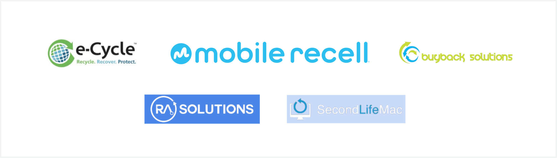
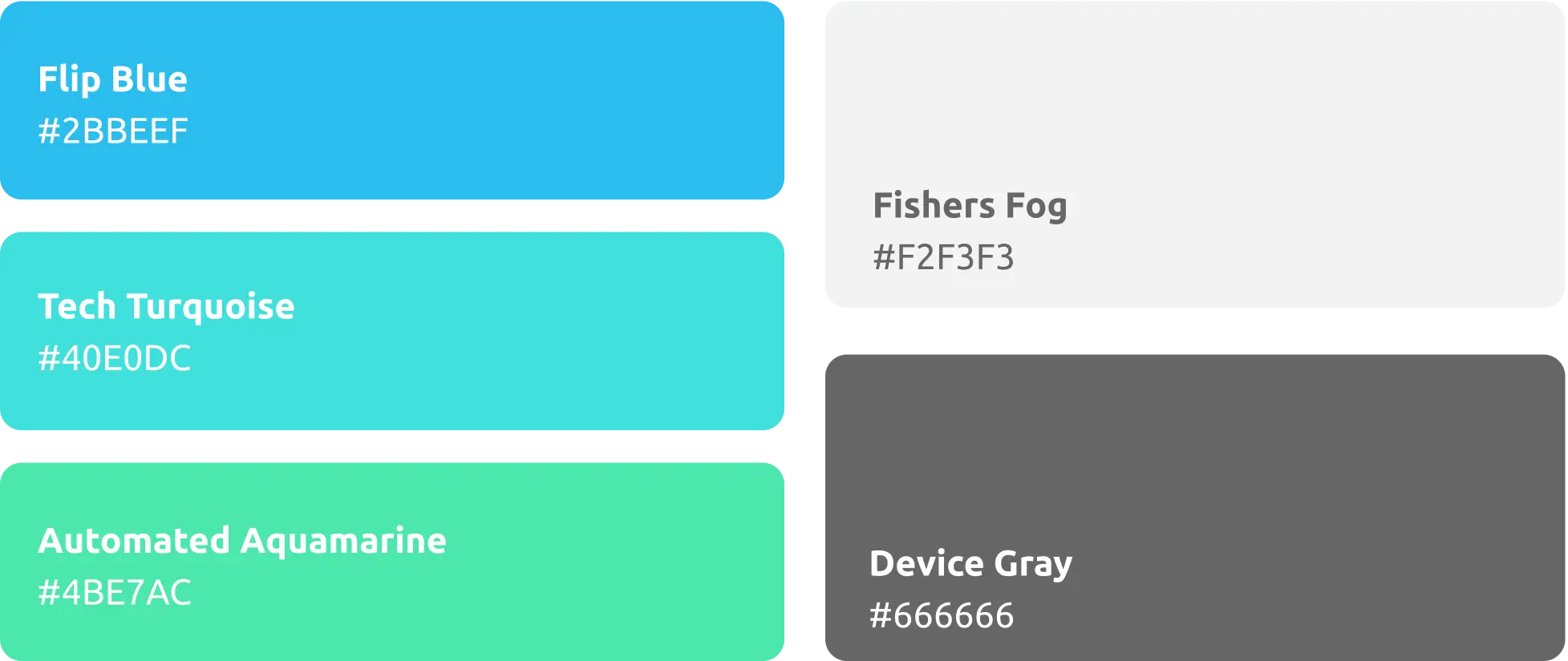
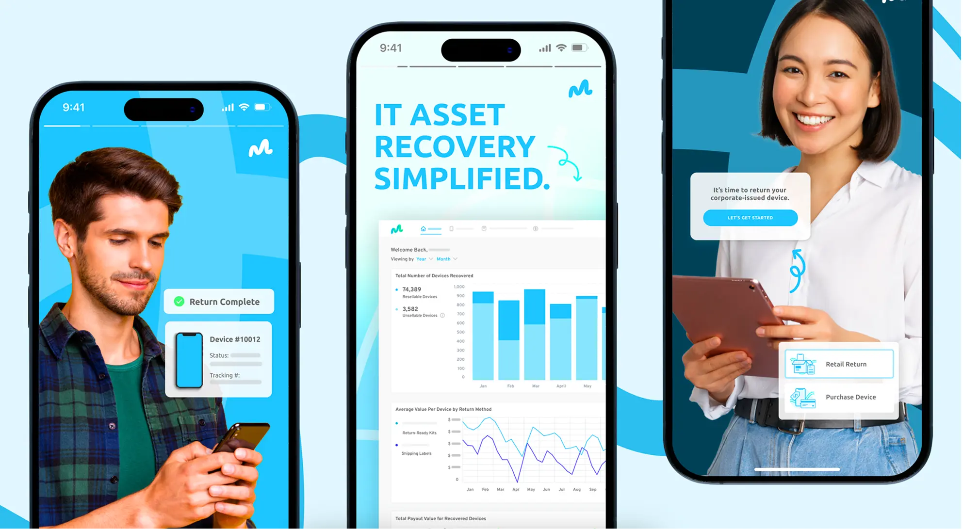
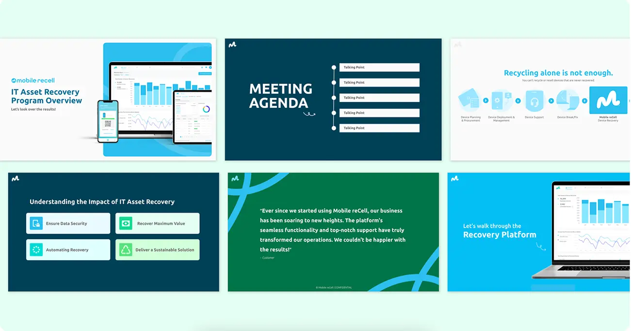
In an industry where competitors are not focused on enhancing the customer experience, the Mobile reCell brand needed to communicate transparency and consistency, with a touch of fun to build trust. The brand needed to support the education of the benefits of IT asset recovery, which is often overlooked by businesses. As well as needing to enable quick creation of marketing materials by the small Mobile reCell team while ensuring consistency.
The logomark symbolizes progress and ambition. Its upward motion signifies growth and achievement, reflecting the goal of revolutionize the IT asset recovery industry. After exploring various idea, the final logo was chosen for its simplicity and ability to encapsulate Mobile reCell's essence and future possibilities.
.webp)
.webp)
.webp)

.webp)

.webp)