Waka's Mexican
Role: Brand Designer
Industry: Food
Completed: May 2025
Waka’s is a Muncie, Indiana-based taco cart serving authentic Mexican street food inspired by Chef Walker’s childhood summers spent in San Antonio and expircing the vibrant street food culture in Tijuana. With bold flavors, fresh handmade dishes, and a welcoming atmosphere, Waka’s hope is to be not just be a quick bite but a space for community.
I was contracted by Waka’s to create a full brand identity that captured the mission, authenticity, and community spirit of their food cart. Drawing inspiration from Chef Walker’s personal story and the lively aesthetics of San Antonio's annual Fiesta, I developed a visual identity that feels friendly, modern, and full of energy. The project included brand strategy, visual identity design, color palette development, typography selection, and the creation of supporting graphics and patterns. Vibrant colors, dynamic patterns, and playful illustrations were used to evoke the feeling of a backyard summer fiesta—inviting people to not only enjoy great food but also connect with their community.
Brand Research
To kick off the project, I interviewed Chef Walker about his story, vision, and goals. He shared memories of summers in San Antonio and a trip to Tijuana that shaped his love for Mexican food and its sense of community. His mission: bring bold flavors and approachable energy to his city, with long-term plans for catering and a brick-and-mortar restaurant.
Research drew from San Antonio’s Fiesta traditions, cowboy culture, and Mexican street vendors, paired with inspiration from bold, playful food brands like Torchy’s Tacos and Chuy’s. Competitor analysis revealed an opportunity for Waka’s to stand out with a friendlier, more community-driven identity supported by a mascot and simplified visuals.
This foundation ensured the final brand identity felt authentic yet modern—positioning Waka’s as more than a food cart, but a vibrant, recognizable favorite with room to grow.

Logo & Core Brand Elements
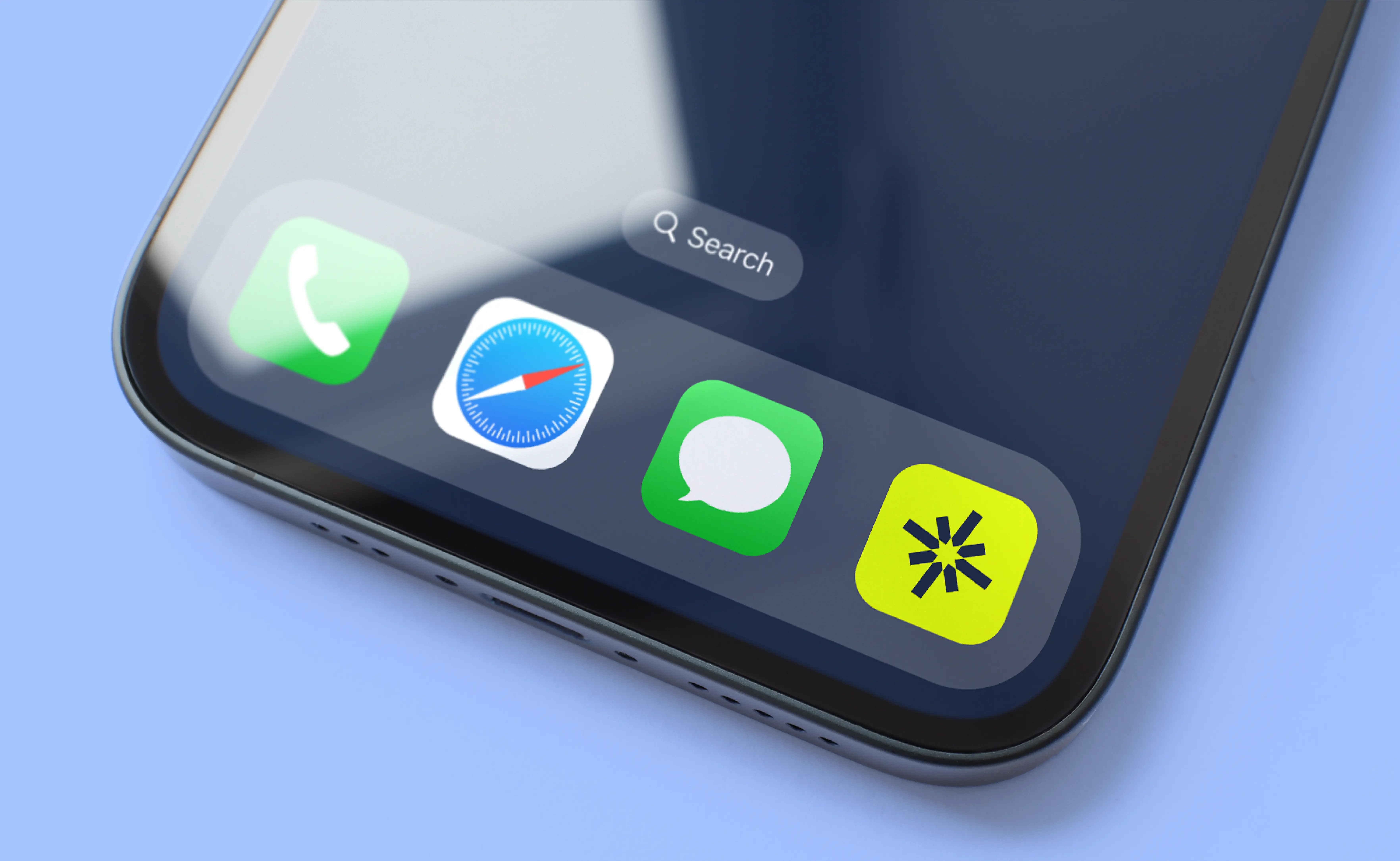
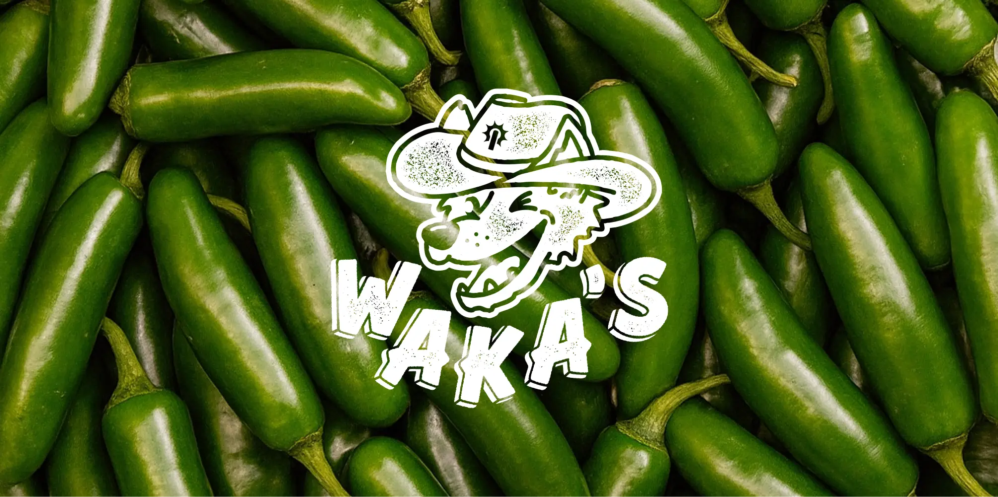
The brand identity centers on a coyote mascot wearing a cowboy hat. Chef Walker wan't the brand to feel light and fun with a little edge. A coyote felt like the perfect mix between charming and cunning for this brand. The chosen logotype is inspired from vintage Mexican street food signage, using hand-painted lettering with dimensional outlines.
A stamped texture references the tactile authenticity of street vendors and fresh ingredients. This texture is prescent through out supporting materials.
The red and teal color palette balances appetite appeal and modern vibrancy, nodding to both Mexican design traditions and the cultural influence of San Antonio’s fiesta colors.
.webp)
Color & Typography
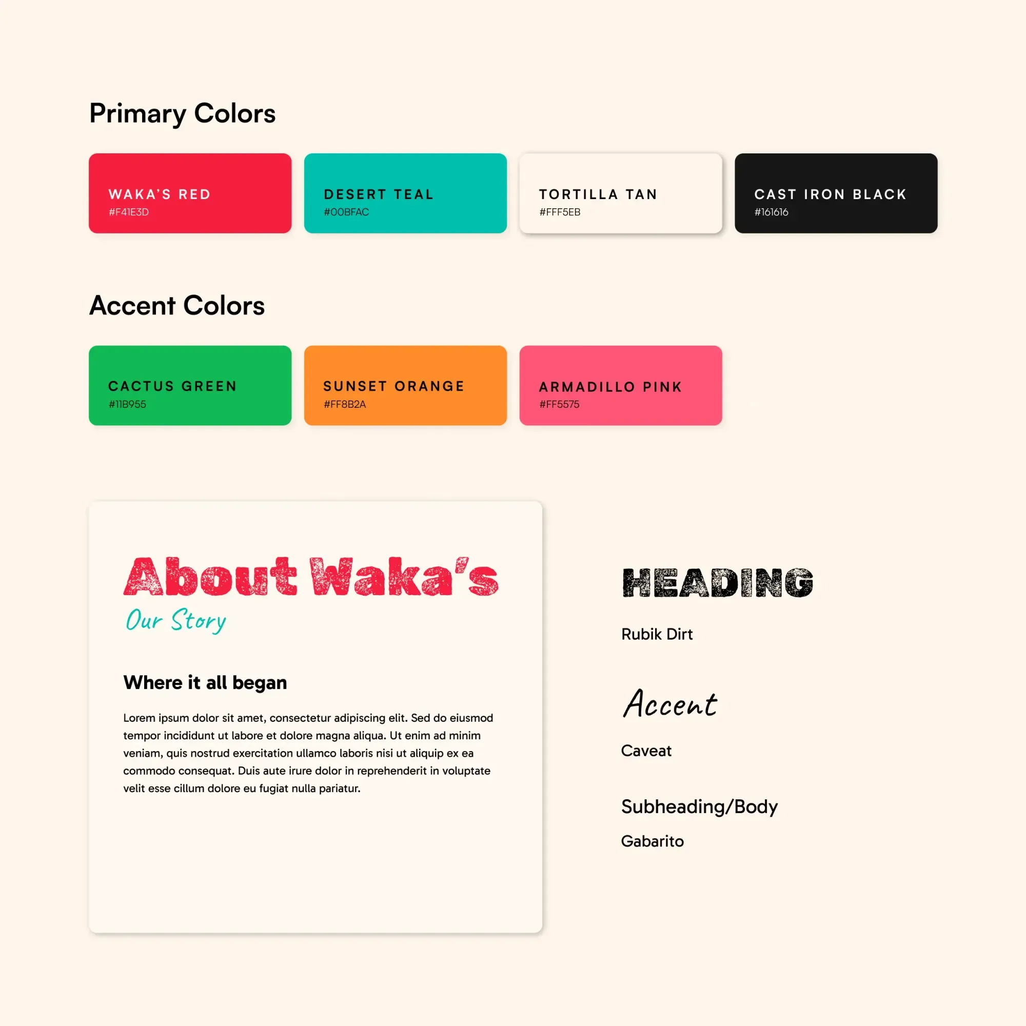
Red and teal are the foundational colors for the brand palette, paired with light cream and dark gray for balance. Red serves as the dominant background color, while teal used for accent to red, with supporting accent colors adding flexibility for icons and complex visuals. This system ensures consistency across both print and digital applications.
The typographic system reinforces the brand’s authentic yet playful personality. Rubik Dirt anchors headings and mirrors the stamped style of the logo. Gabarito, designed by South American creatives, offers a clean, rounded form for body copy that feels approachable and contrasts the rugged heading type. Caveat, a hand-drawn script, adds expressive flair when paired with Rubik Dirt, most often in teal or white for emphasis. Together, these choices create a versatile, cohesive voice for the brand.
.webp)
.webp)
.webp)
.webp)
.webp)


.webp)